Roles
- UI UX Designer on a team of two
- User Tester
Analyzing Problems
Challenges
Mobile Responsiveness: The existing system was primarily designed for desktop use, resulting in a poor user experience on mobile devices
Diverse User Personas: The system failed to cater to the varying needs and preferences of different user personas, including administrators, employees, and customers.
Outdated Interface: The user interface lacked modern design principles, hindering usability and engagement.
Technical Constraints: Retrofitting a legacy system to meet modern standards while preserving existing functionalities posed significant technical challenges.
Goals
I want to understand and explore the following areas:
- Who uses the system?
- What are their current experiences and pain points?
- Understand how the code base is structured and determine the limitation that could impact on UI and task flows
Methodologies
- In-depth user & stakeholder interview
- Initial user testing on current U
- Understanding current users & task flows to make suggestions & enhancement
Research
Stakeholder Interviews
The general pain points identified encompass:
- Lack of mobile-friendliness, restricting accessibility and usability on handheld devices.
- Inconsistent branding across the system, detracting from a cohesive user experience.
- Certain features are obscured, necessitating employee intervention to guide users on locating and utilizing them effectively.
- Despite the presence of a help page outlining system navigation, users still encounter challenges in navigating and utilizing the platform effectively.
Statements: If UI is not obvious enough, “Houston, we got a problem !”
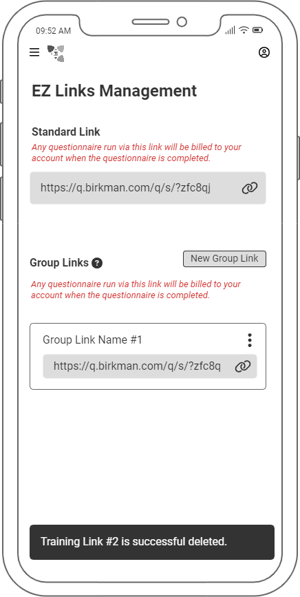
As we delved deeper into our investigation, we uncovered the intricacies of the system, revealing a complex structure accommodating eight distinct user personas. Each persona interacts with the system in a unique manner, tailored to their specific roles and responsibilities. Remarkably, one persona does not directly access the system but instead inherits one of its key products. Consequently, every role presents its own set of pain points, intimately tied to their daily utilization of the system
User Interviews
The result confirmed all of the pain points in the analysis stakeholder responses and more.
We analyzed the current structure and all the functions, tools, and resources in-depth. We used some of the UX laws to identify the following pain points:
- Pages, buttons, links, etc. are not labeled correctly in terms of destination or what it’s supposed to do and even was hidden behind another component.
- It has not followed today's UI pattern of how users navigate through the sites.
- 3 navigation bars on both sides of the page and top of the page.
- A logo that is not clickable to bring us back to the homepage.
- Pages with different functions/ purposes get merged. The user got confused initially and had to constantly remember what page for what functions.
We've identified two primary target user groups for this project. The first category comprises long-time users who have been utilizing this product for as long as it existed. They are proficient in navigating the existing UI, which may present a challenge when transitioning to the newer, more prevalent UI patterns of the last decade. Conversely, the second category consists of new users who are unfamiliar with the legacy UI and are more inclined to adapt readily to the current UI patterns.
Problem Statement
Current system limitations hinder users' ability to efficiently issue questionnaires, generate reports, and facilitate coaching sessions while on the move, necessitating a solution that enables seamless and rapid access to these functionalities from any location.
Obstacles/Constraints
Technical Constraints: Retrofitting a legacy system to meet modern standards while preserving existing functionalities posed significant technical challenges.
Time constraints: we met with the developer team and sorted out a few areas that we can accommodate from both sides:
- We agreed to only cover extra small (428px) and large (1200px) viewports. I proposed these two numbers because they can accommodate the shifting and changing of the next 2 nearby viewports without requiring extra accommodations from the UI.
- We agreed to use the material library for icons as it is easier for developers to get the icons and not have to wait on the designers
- We agreed to adapt the Bootstrap layout and follow its default specifications except for the viewports that we discussed above.
Solutions
We prioritized the pain points by their severity and frequency of occurrence. We started analyzing what flow can accommodate a large number of user roles and laying out the structures of the system with mobile first. We consider both user flow and task flow.
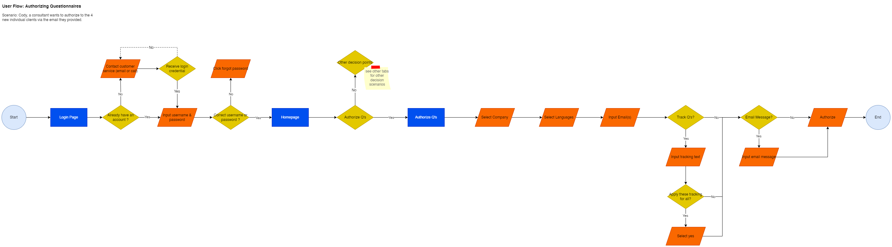
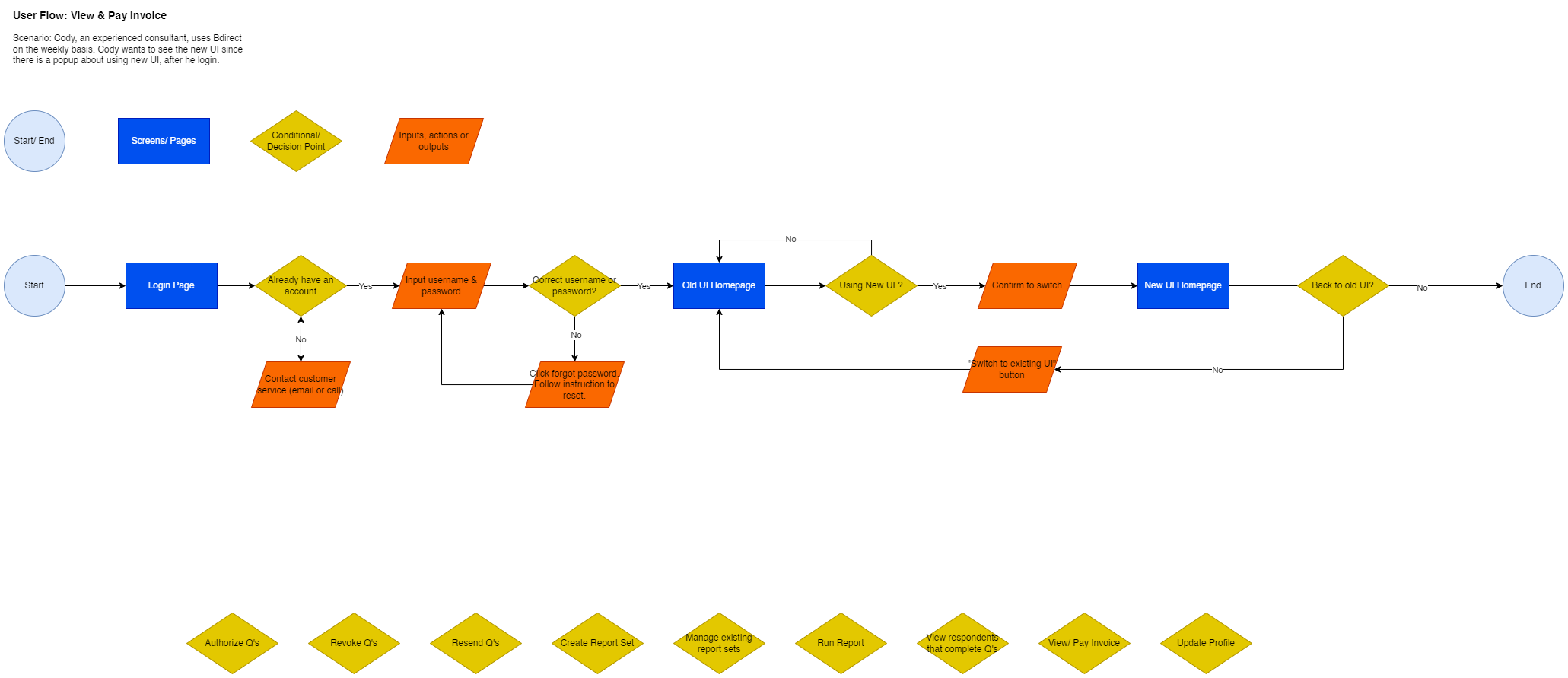
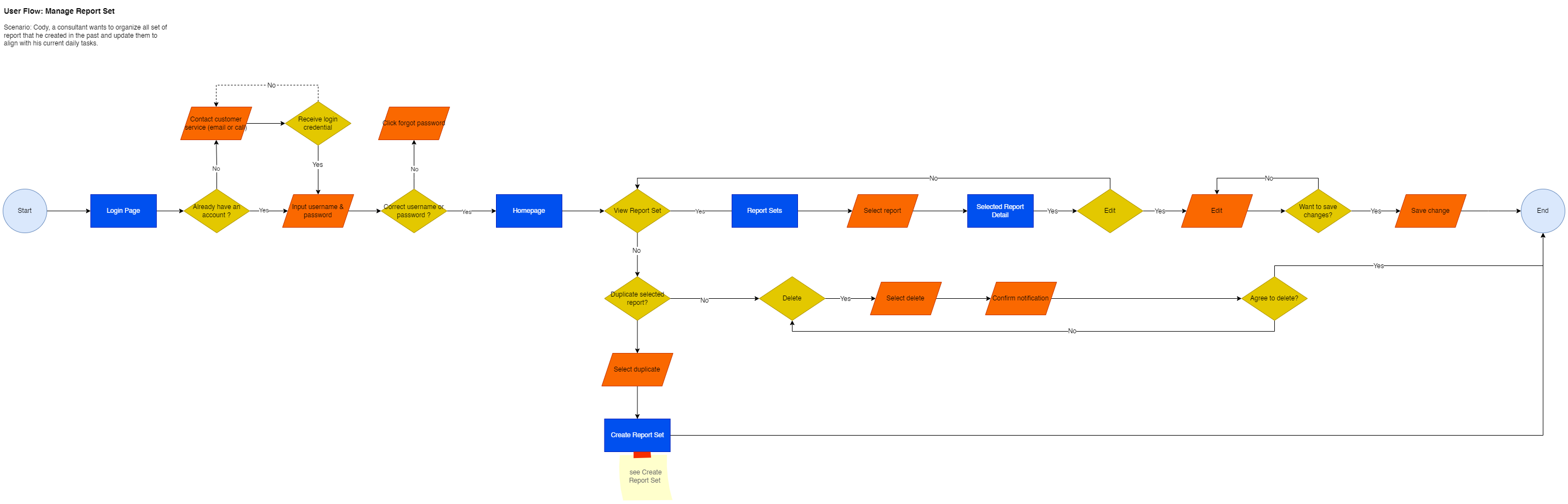
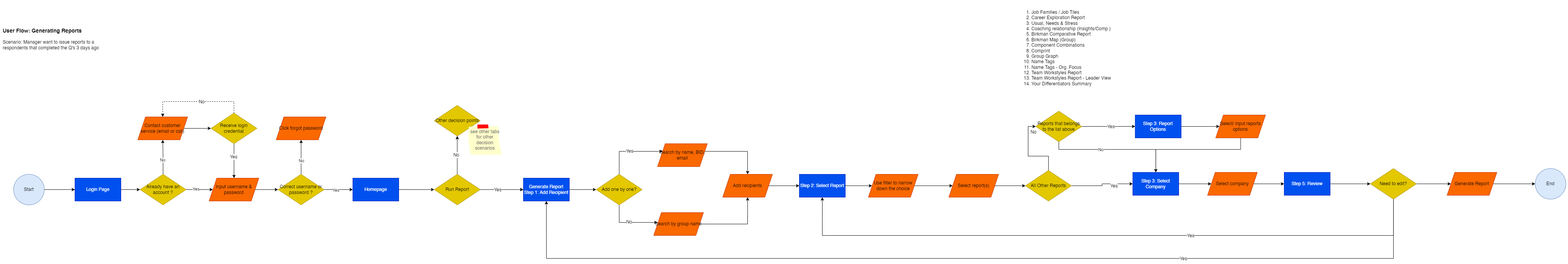
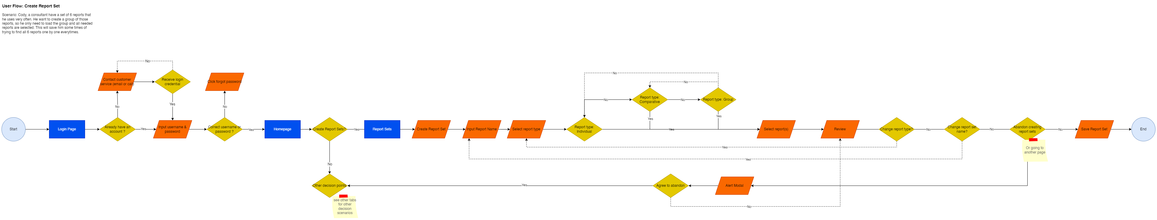
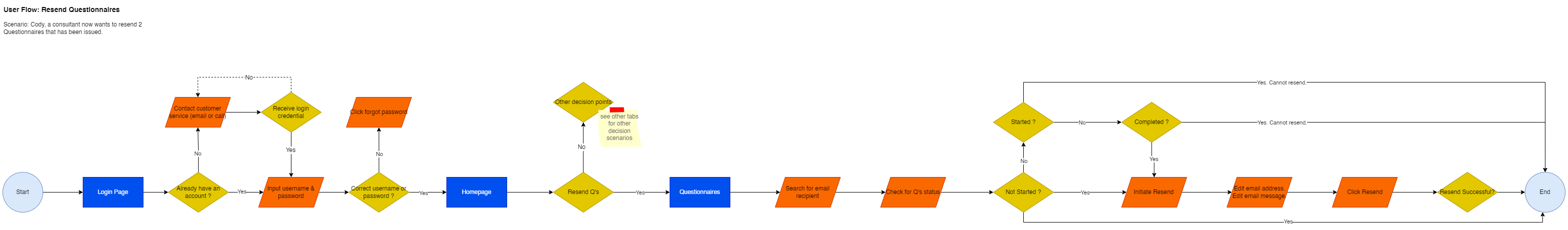
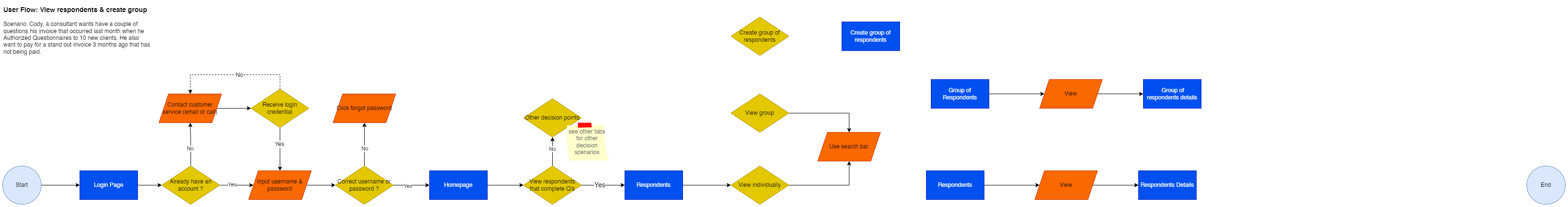
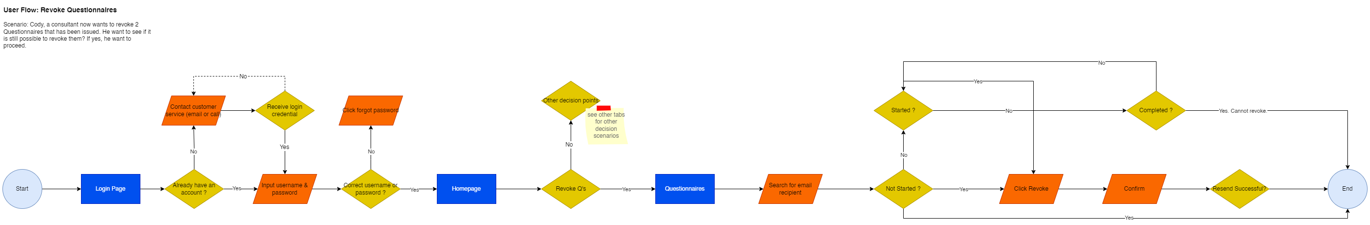
Task & User Flows
Low Fidelity & User Testing
After a thorough view of what is the problems and the direction to make improvements, we started the execution process with low-fidelity wireframes.
The initial versions allowed us to run a quick user testing with some stakeholders and a few users. We get to see the users’ feedback with this new layout and the flow and how well they adapt to this up-to-date UI pattern.
These initial iterations enabled us to swiftly conduct user testing sessions with select stakeholders and a small user sample. The feedback gathered on the new layout and flow provided valuable insights into user adaptation to the modernized UI pattern.
As anticipated, Jakob's law proved its merit. While our users may not possess advanced technical skills, their familiarity with the UI facilitated a seamless transition to the updated pattern. User feedback echoed this sentiment, with comments such as, 'This is easier to use and navigate than the current UI.'
With minor iterations based on user input, we progressed to the development of high-fidelity prototypes and design systems, confident in the positive direction of our design enhancements.
Design Systems
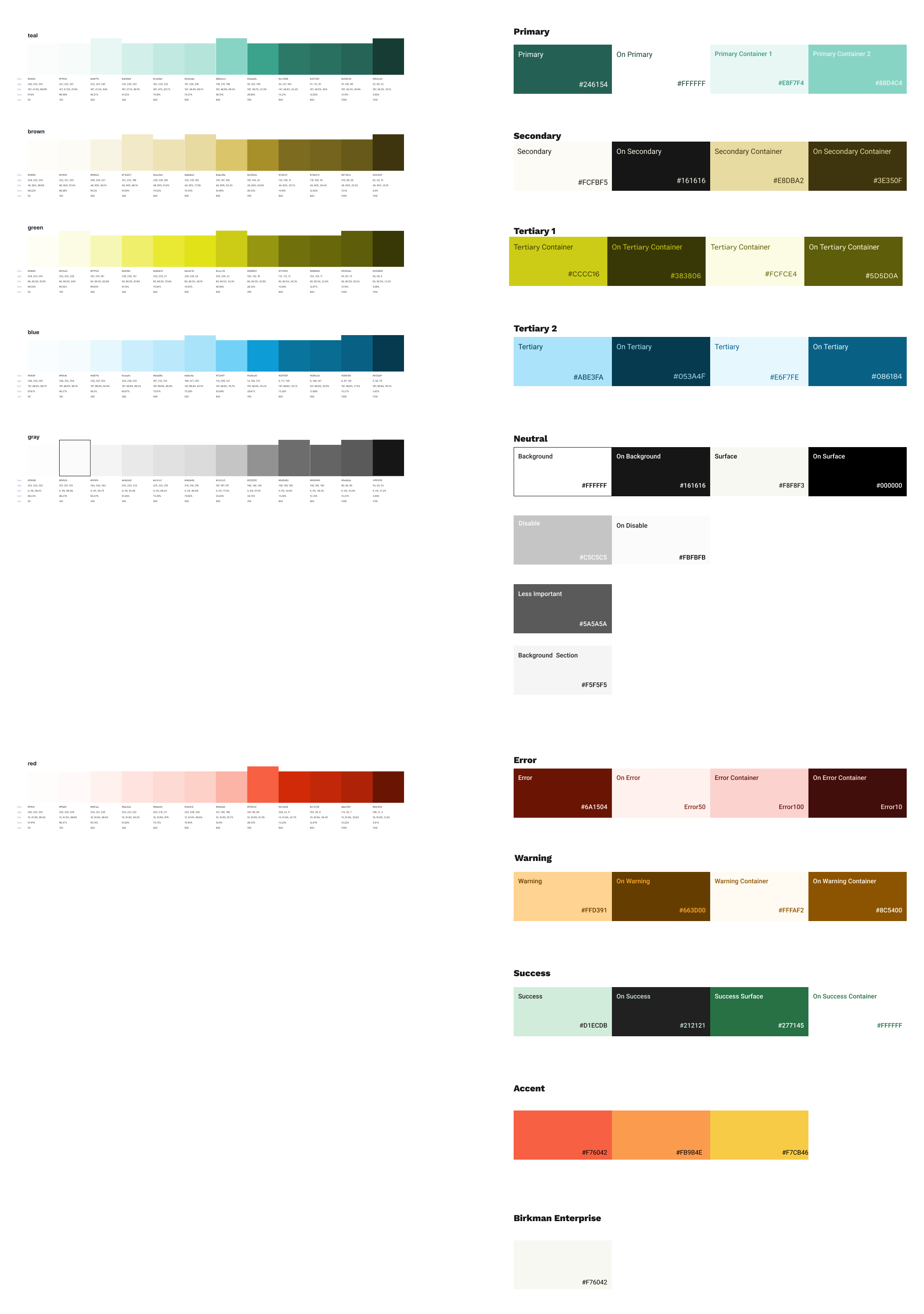
- We adopt the new brand guidelines to create a branch consisting of:
- Embracing green as our primary color, we expanded our palette with a diverse range of shades and tints to create a comprehensive primary suite. Additionally, we introduced yellow and brown as our secondary and accent colors, enriching our palette with a vibrant and harmonious blend of hues.
- Integration of an 8pt grid system to ensure consistency and alignment across all interface elements
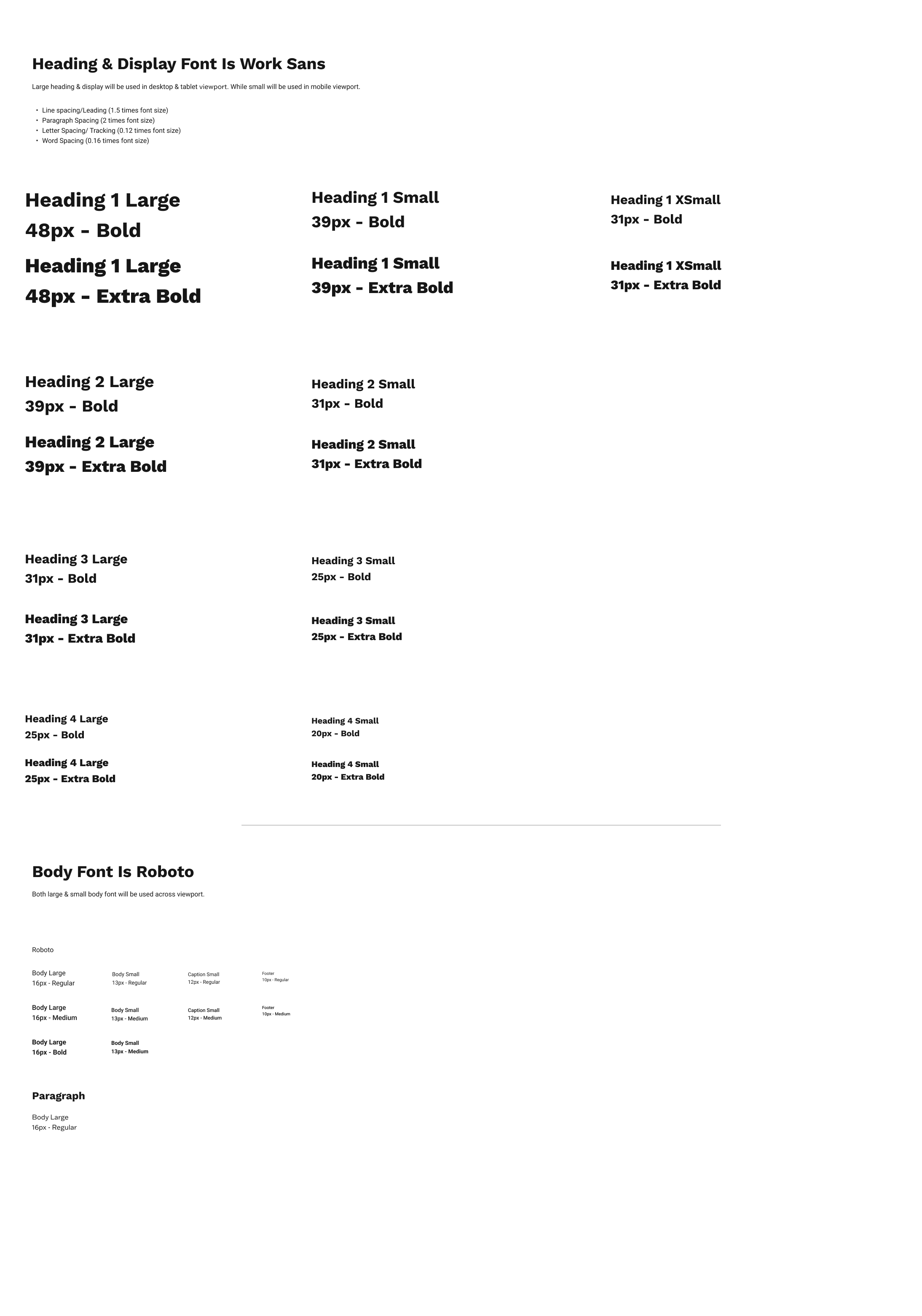
- Within the guideline, Work San was defined to be used as body text and Roboto was used as the heading. However, with a data-centric UI the content will be sacrificed. So we met with the designer to confirm and flip these roles between the typeface for a smooth experience where content doesn’t get cut off unexpectedly.
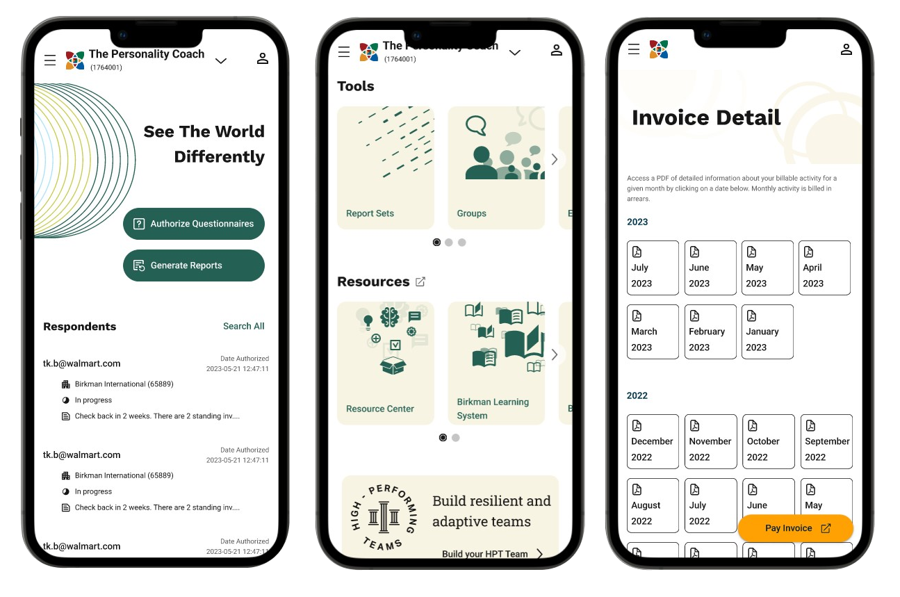
- Development of an extensive library of UI components, encompassing buttons, list items, input fields, steppers, and more.
High Fidelity & User Testing
**Given certain confidentiality considerations, access to high-fidelity prototypes is available exclusively upon request.**
Falling Action
We noticed that too few interactions or details in low fidelity didn’t draw out all the feedback we expected from the users. We have to pay attention and emphasize that thin line to guide our project’s final iterations
Results
- The successful revitalization of the legacy system demonstrates the importance of adapting to evolving user needs and technological advancements. By prioritizing mobile responsiveness and persona-based customization, the system now offers an enhanced user experience that caters to the diverse needs of its users.
- Improved User Satisfaction: Users expressed satisfaction with the enhanced mobile responsiveness and personalized user experience, leading to increased engagement and productivity.
- Enhanced Accessibility: Compliance with accessibility standards improved inclusivity, allowing users with disabilities to access and interact with the system effectively.
- Positive Stakeholder Feedback: Stakeholders praised the revitalized system for its modern interface and improved functionality, positioning it as a valuable asset for the organization's digital strategy.