Improving MYB
Roles
- UI UX Designer
- User Tester
Product Objective
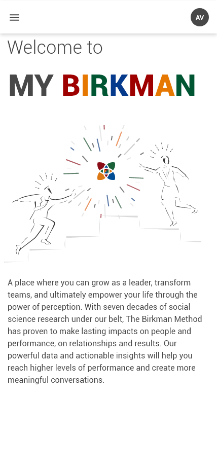
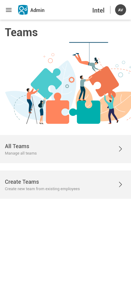
This application is meant to help employees within an organization that has taken Birkman Questionnaire to see the overall strengths, personalities, etc., and how well it fits into different teams within that organization. Not only that, the system will allow certain users within the company as admins to manage the organization's account. The admin user will be able to add and remove employees, and teams, manage products, etc.
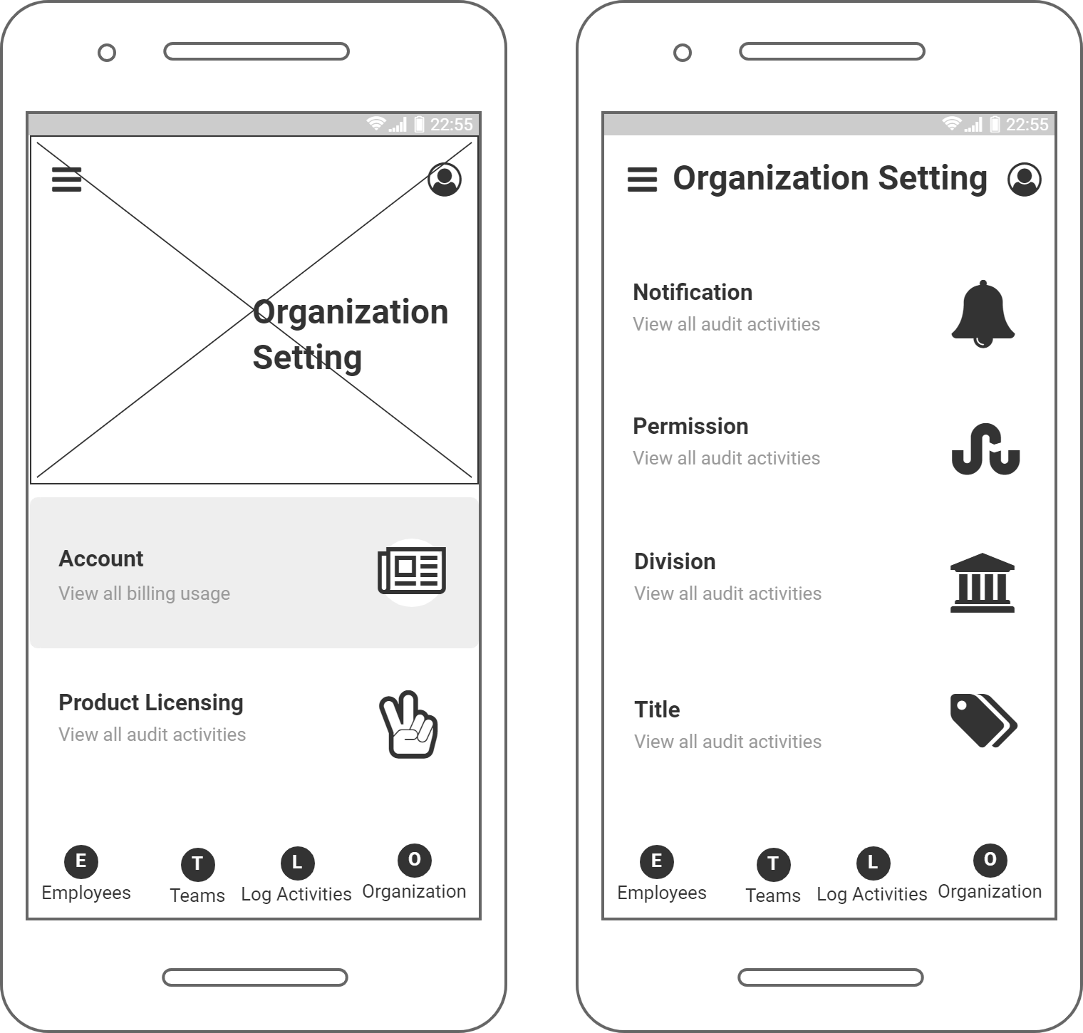
On top of these two facing-customer products, the application also provides internal tools to help manage and create new content. Hence the concept of Workspaces.
Research
There are quite some combinations with different colors and different shapes that represent certain personality traits. I wonder how many users out there have the same questions as I have. To shape the vision of this project, I used quantitative, qualitative and behavioral metric it could help me understand how well users understand the product overall and how easy for them to interact with this product.
At the time, the system does not have any tracking or analysis tools that built into the site. I sought the company website and used the data from there. It is not ideal, but at least it gave me an overall look at what our users like when comes to one of the company websites. I need to know what devices they are using, how long they normally stay on the page and where on the page they spend their most time.
With qualitative & behavioral metrics, there is no method that is better than user interviews and tests.
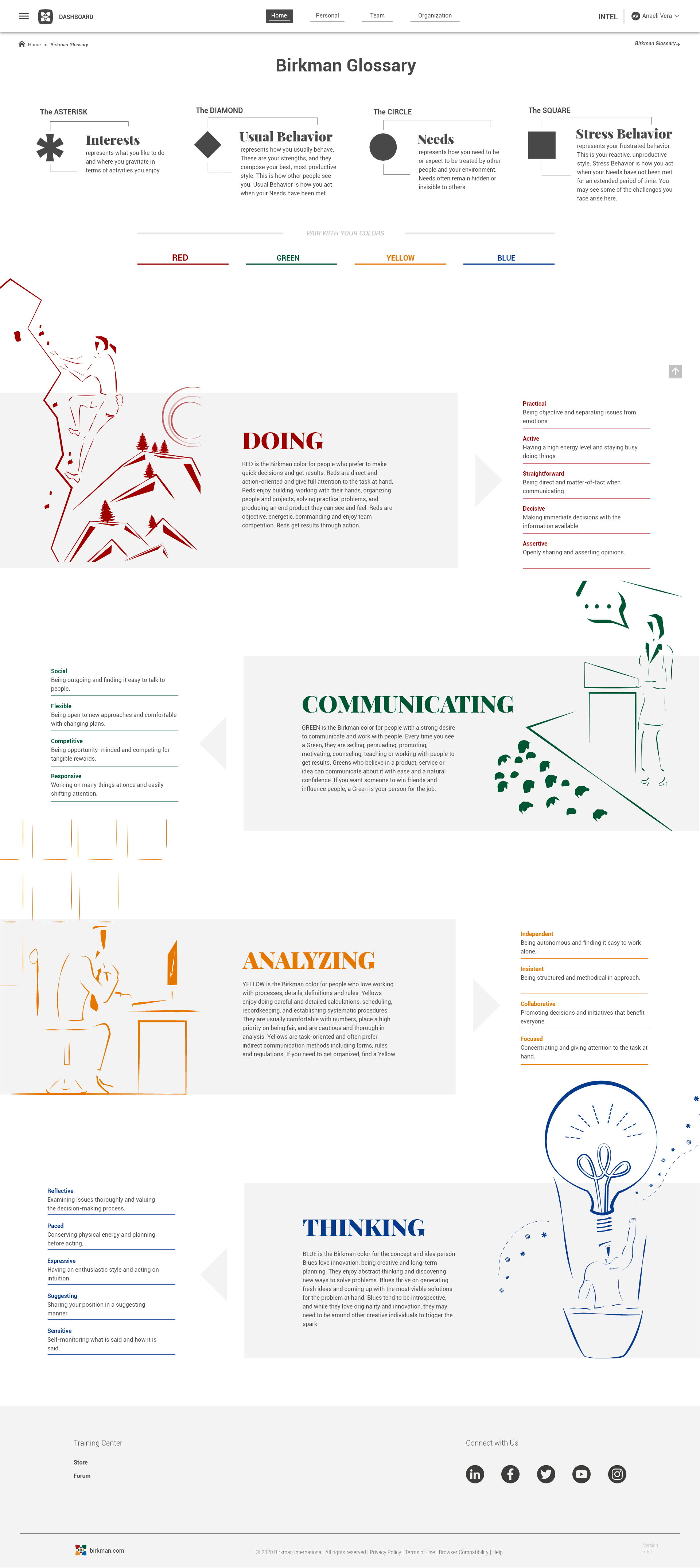
Desktop View
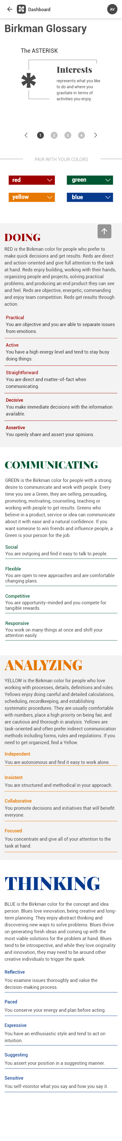
Mobile View
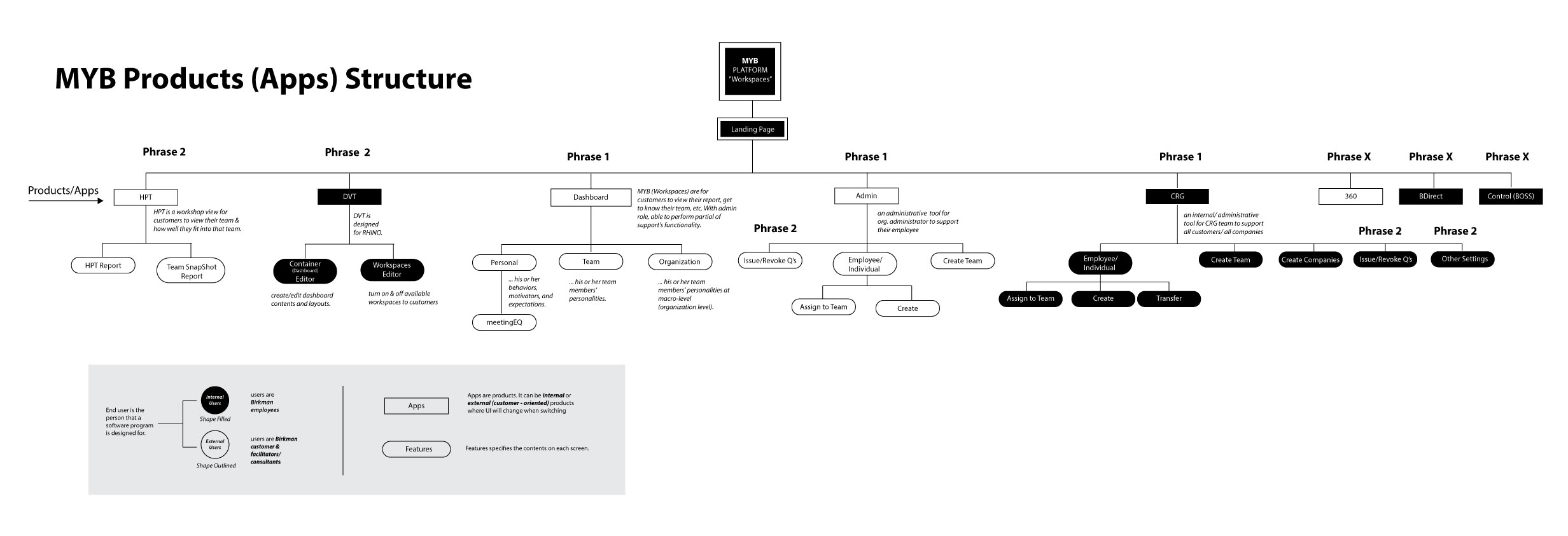
Site Map
This is a new application that was proposed before I came on board. Personas and user journeys have been done, so I created a site map to capture all the possible flows.
A site map helps visualize the structure and relationship of each workspace. It also helps me understand the priority for each function in each release.
Solution
Creating a hub to provide administrators with the tools and guide users through the meaning of the product’s content and how to access this content. Focusing on visual aspects to maintain the consistency and show casing brand identity.
Brainstorming
When it comes to individual sessions, paper and pencil are ideal. I find it very helpful to see all my thoughts laid out visually. Then a team session, to discuss all the ideas with my teammates. There is no particular order to these sessions, and we can have as many as we need until we find the answer to the question at hand.
Key questions: "Are these enough ideas for me to start the wireframe?"
Sketch/Wireframe & Low Fidelity Prototype
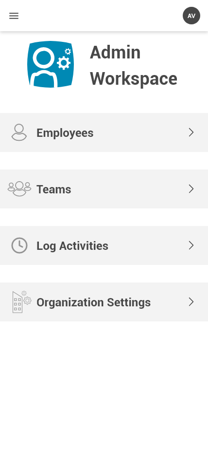
More often enough I use Balsamiq, the software helps visualize the first skeleton of the UI. The challenge I’m facing in this project is navigation. I have 5 different workspaces, and each workspace has its own menu items. The placement of these menus is crucial to help users understand where they are at and how they can move around in the system. I also often check in with the developers to make sure the features are feasible.
Key questions: "Can I represent this wireframe to the stakeholders?"
Design System
Here comes my favorite part of the project - seeing all these plans come to live. I usually create the design system base on branding guidelines, to make sure the consistency of the company’s digital products across platforms/media.
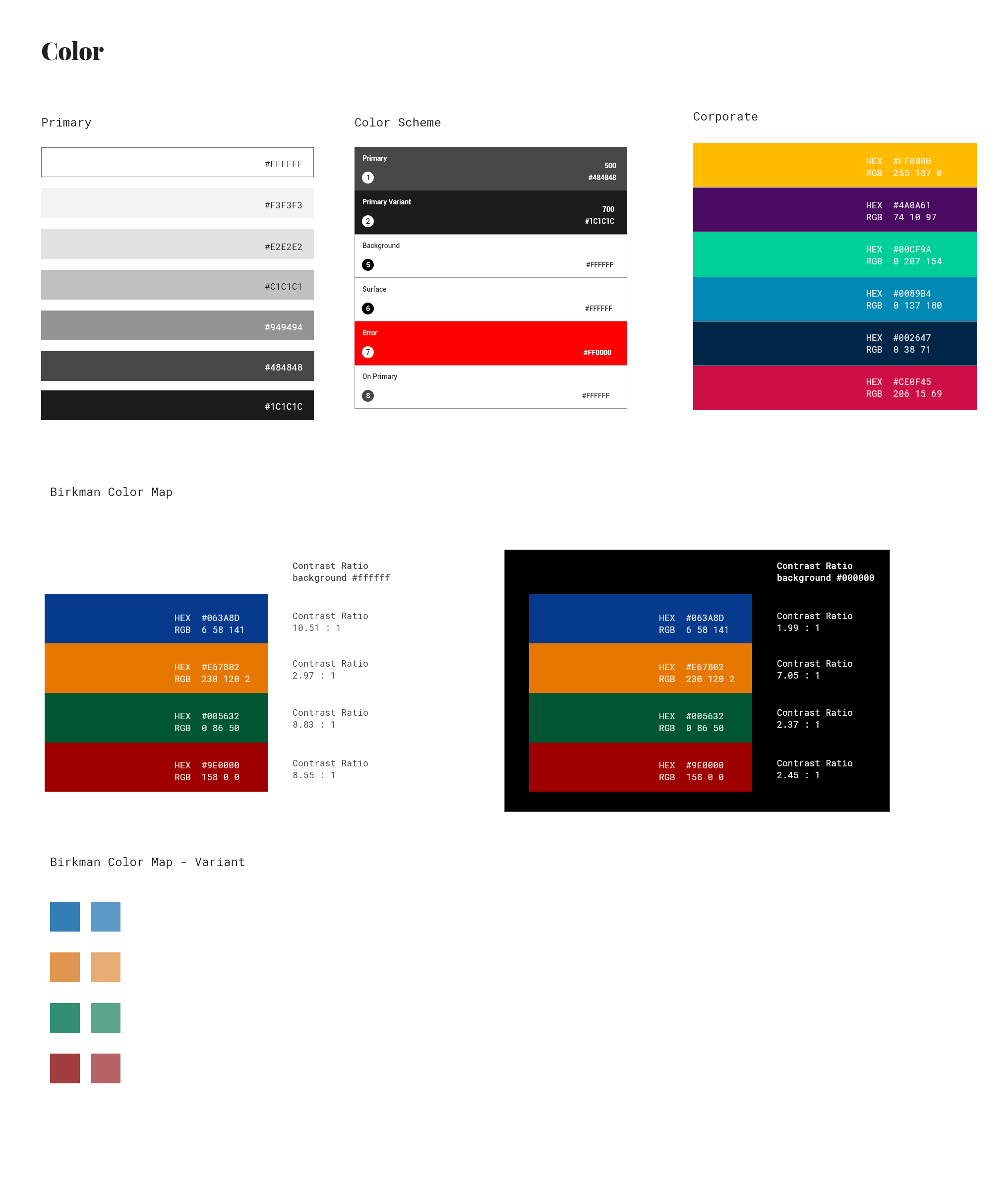
Color Scheme
The principle is to use the logo of the company to started the color system. However, due to the logo's complexity with four distinct colors, each carrying significant meaning, incorporating them alongside the additional five colors from the branding guidelines risked overwhelming the interface, resulting in confusion rather than appeal. Consequently, I advocated for a nuanced approach, introducing a complementary palette of varied tints and shades of grey to elevate the logo's four colors while maintaining visual harmony and clarity throughout the interface.
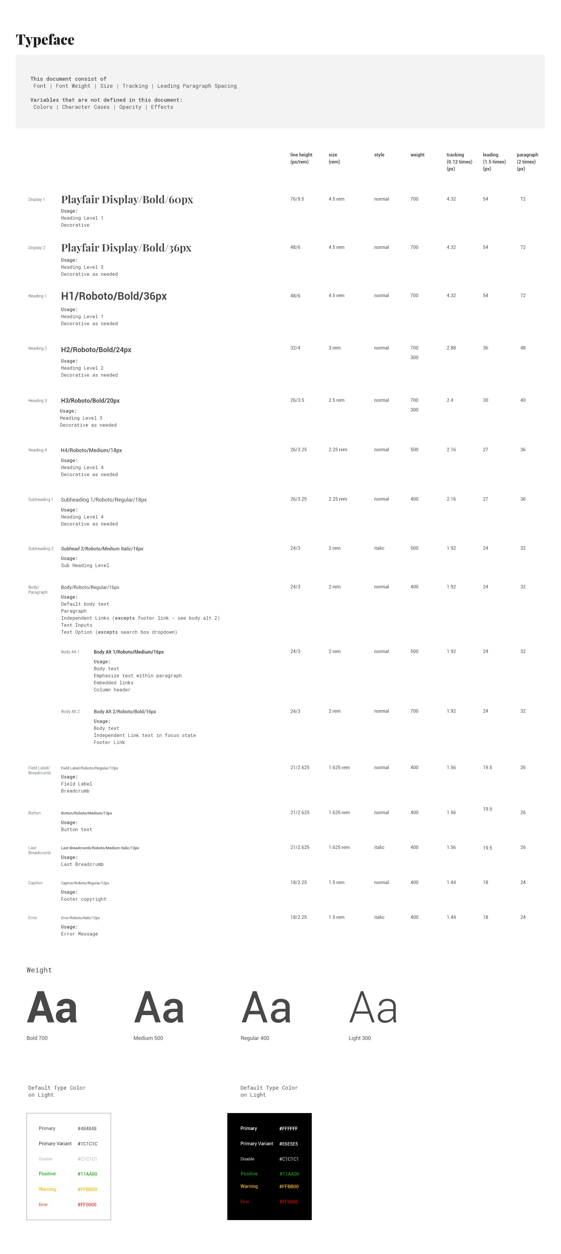
Typography
It sets the mood for the interface, the first impression, the experience. I use the modular scale with a ratio of 5:6 (1.25). See more about my typography article.
Icons
I got to create 50% of the icon library in this design system. It was a fun project, despite the fact that designing icons was my weakness.
Other UI components
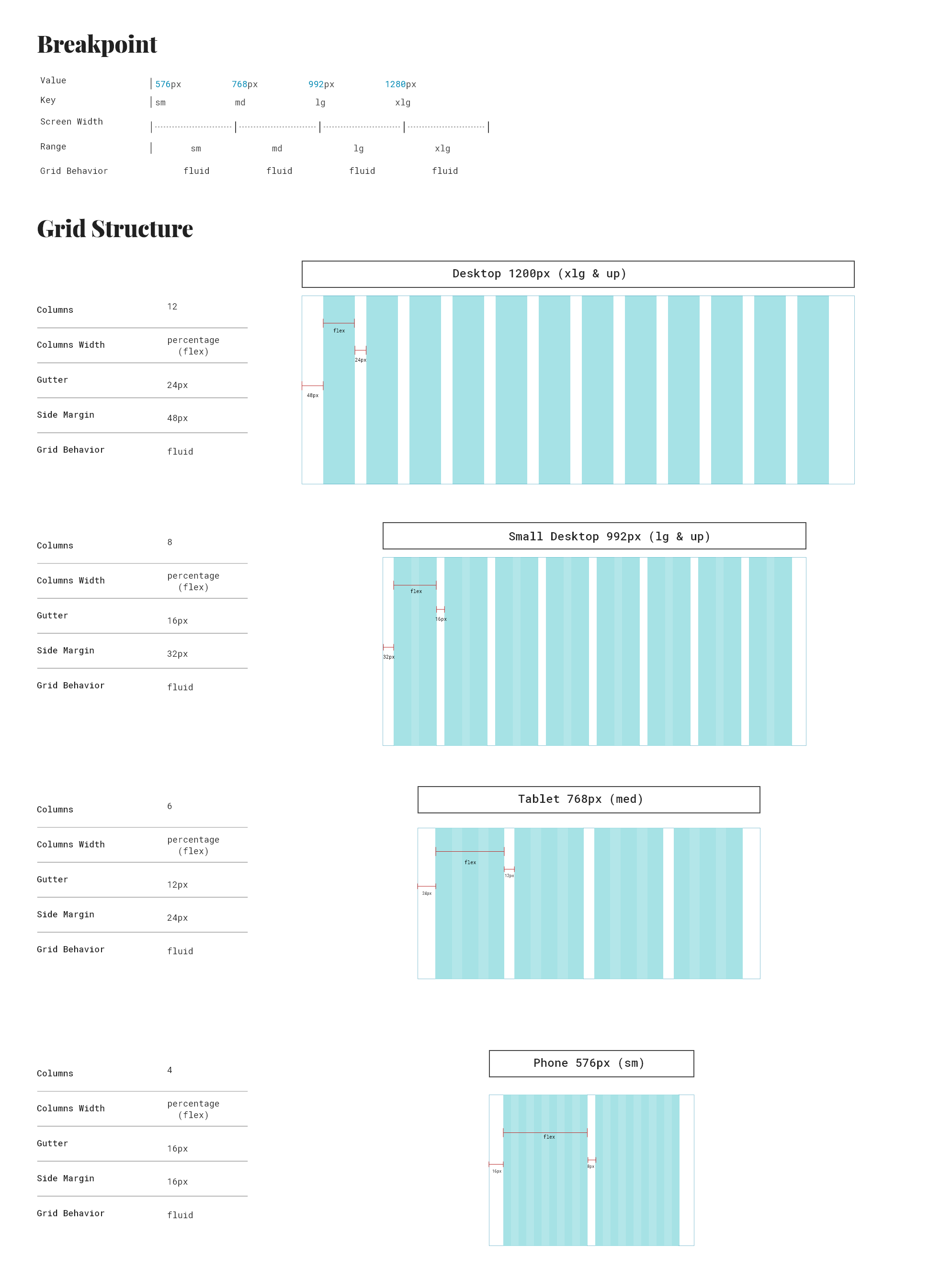
Setting styles, specs for multiple components, and making sure that they will work across viewports.
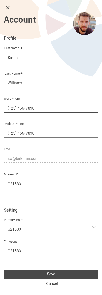
High Fidelity Prototype
I made sure that all the possible outcomes that developers can think of will be covered in the UI. I worked closely with the product manager and the research team to make sure that everything we planned are all addressed in the prototype.
User Testing
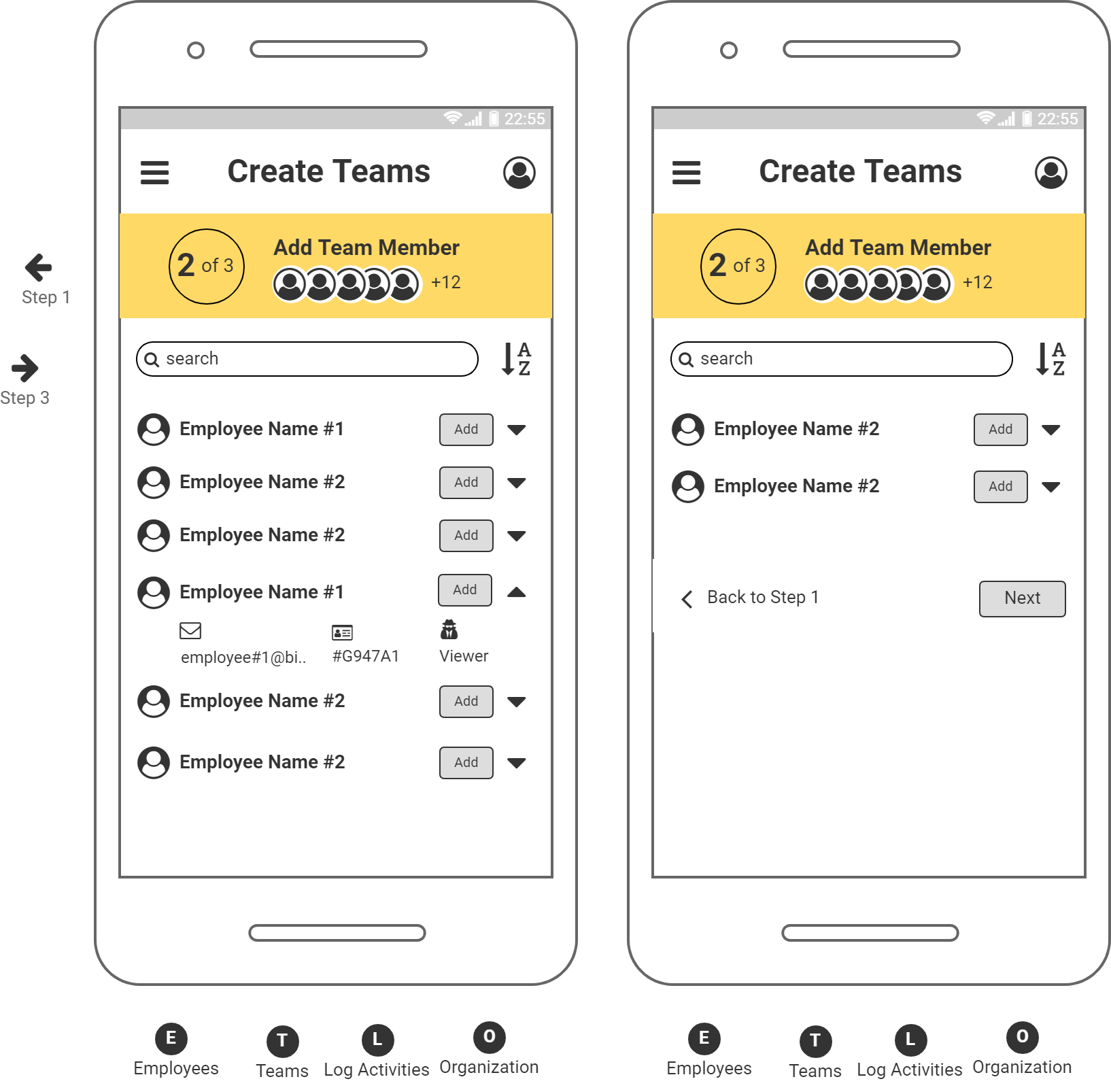
A lot of useful feedback came back, for example: different page layout works for the content of each page but there is one that users get confused between adding members table vs already added member.
Conducting user testing at this stage is the best part. I had about 8 users and was using quantitative method to identify how this new UI system appealing to them. such as and the process of iteration starts, and more user testing.
- Observe users interaction & experience with the product
- Identify potential pain points
- Addressing flow, appealing, accessibility, etc.
Created a test plan and conducted more user testing session to make enhancement on next release.
The UI has a good feedback from the demo. Giving the users a new look but maintain brand identity. But more importantly, did I address all the objective that were set out?
Launch
The UI has a good feedback from the demo. Giving the users a new look but maintain brand identity. But more importantly, did I address all the objective that were set out?
Result
Created a test plan and conducted more user testing session to make enhancement on next release.